How I reduced missed pickup promises by helping the Service Center Manager identify risks early
The centre was running daily operations through whiteboards, sticky notes, job cards, and memory, so I designed a connected desktop system to help the manager see what needs attention and keep cars moving on time.
ROLE
Product Designer
TIMELINE
4 Weeks
SKILLS
Vibe Coding
Product Design
TOOLS
Paper
Claude Code
Conductor
Figma
TL:DR
What: Designed a desktop operations system that connects cars, jobs, bays, blockers, queues, and performance.
Why: Fragmented tracking across whiteboards, job cards, and memory made it difficult to identify delays early and make confident floor decisions before pickup promises were affected.
Outcome: The concept helps managers prioritise faster, see operational context clearly, and act before delays spread.
My role: Worked as a solo product designer. Owned the workflow, architecture, interaction model, visual system, prototype, operational scenarios, and early validation.

Explore the Prototype
Fully interactive with simulated scenarios, walk through a blocked car, the morning brief, and the analytics page.
Open Prototype
SOLUTION
Revon, a desktop operations system for the centre manager to run the service floor from one place.
It brings together cars, jobs, bays, mechanics, approvals, parts, shared-station queues, and promised pickup times, so the manager can quickly understand what is happening, spot risks early, and decide what should move next.
I tested the concept with service-centre managers, who responded positively to the overall clarity and usefulness of the system. While the operational impact still needs to be validated in a live shift, the solution was designed to influence these four outcomes:
More cars stay on track for their promised pickup time by surfacing risks earlier.
Reduce avoidable blocked-bay time by making approval and parts delays easier to spot and act on.
Support faster turnaround by giving the manager clearer visibility into workload, queues and next actions.
Prevent more pickup misses before they happen by highlighting at-risk cars while there is still time to intervene.

UNDERSTANDING THE PROBLEM
The center could track the work. The harder part was knowing what needed attention next.
With around 40 cars moving through limited bays, multiple jobs, approvals, parts, and shared stations, small delays could quickly affect the rest of the floor.
Centre workflow and operational reality
The manager had to piece together updates manually before deciding what to do next.

Most cars arrive within a short morning window. Each may need several jobs, and a car is only ready when every job is complete before its promised pickup time.
The journey breaks when a car gets stalled due to approvals or missing parts

These gaps directly affected day-to-day business performance
Lost capacity
Blocked ways reduce usable floor capacity.
Lower throughput
Fewer cars move through the same staff and base.
Missed promises
Delays raise the risk of late pickups and unhappy customers.
Customer & revenue risk
Late handovers can reduce trust and repeat business.
Manger's Daily Goals
Keep every car on track for its promised pickup time
Keep bays productive instead of idle or blocked
Spot approval, parts, and queue delays before they spread
Assign and resequence work confidently as conditions change
End the day knowing what went wrong and what carries into tomorrow
Constraints on the service center
Limited capacity
Approximately 40 cars move through a small number of bays each day.
Shared stations
Alignment and wash bays create unavoidable queues
Fragmented signals
Updates come from advisors, mechanics, and parts staff.
Manager away from desk
Manager frequently moves between the screen and the service floor.
Looking across the context, constraints, and workflow helped me frame the core problem: center manager needed one reliable system that could connect these signals before delays impacted the floor.
DESIGNING FOR QUICK SCANNING
The manager needs one place to read the floor, act on what matters, and move on.
My first two explorations were built around showing the full picture… metrics, attention items, arrival queue, bay status, all on one screen.
Both versions worked, and early feedback was positive. But when I tested them, I noticed something: managers were engaging with the screen like it was a dashboard they needed to sit down and read.
That wasn't right. A service centre manager isn't always at their desk. They glance, they act, they move on.


UNBLOCKING A STALLED BAYS IN TIME
The manager needs a way to catch a blocked situation fast and decide what to do next before delays affect rest of the cars.
When a mechanic flags an issue- extra work that needs approval or a missing part- the progress on the car stops. The bay stays occupied. And every car queued behind it starts running late.
The manager needs to catch this early, understand what's actually happening, and make a call: chase the approval, contact the supplier, or move the car to holding so the rest of the queue can keep moving.


BEHIND THE SCENES
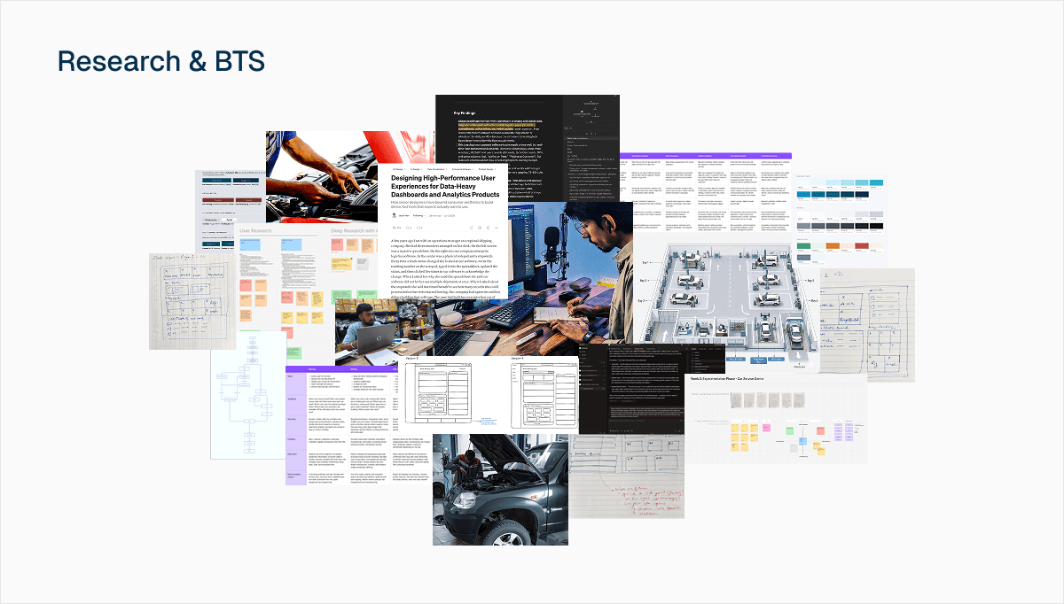
A lot had to happen before any of this came together.
Secondary research into how operations tools handle density and urgency, conversations that helped me understand the floor, sketches, flow diagrams, journey maps, and directions that didn't survive testing. Most of it never made it to the screen… but it's what made the final design possible.
Here is a quick walkthrough demo of the final solution:

Explore the Prototype
Fully interactive with simulated scenarios, walk through a blocked car, the morning brief, and the analytics page.
Open Prototype
LEARNINGS & REFLECTION
